

Yesterday I made a rare trip south of the Thames to visit Apple’s stunning Battersea Power Station headquarters in London, where I was given a chance to try out HomeView (on which I will soon have more to say) as well as the new Apple TV and HomePod mini. And while I was there, one of the product managers helped me to reach a small logical breakthrough.
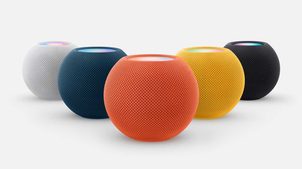
I spend far too much time thinking about product colors, and was quite loudly critical when the options for the 2nd-gen HomePod mini were unveiled last month. There are still five finishes, and these still include black, white, and very dark blue. But the two nicest from 2021, a rich autumnal orange and a glorious marigold yellow, both of which I promptly bought, have been replaced by dark green and a washed-out pink. This, in my opinion, is displeasing.
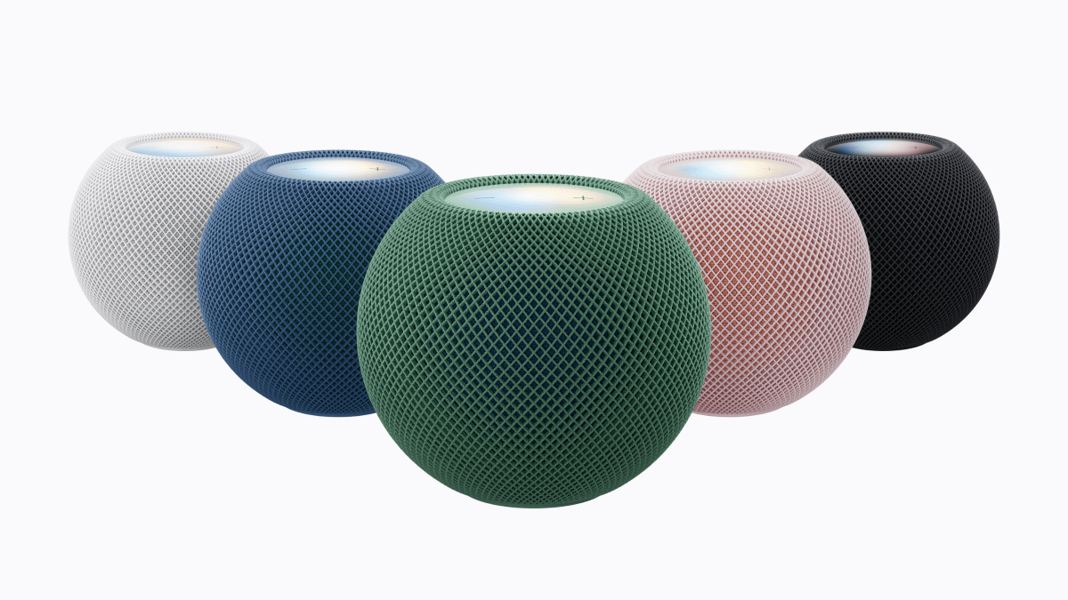
Photography doesn’t always do justice to the color of tech products, and my first thought when wandering around the demo environment was that the new HomePod mini looks nicer in the flesh than I expected. The pink is still paler than I’d like, but it’s fine, and the green is undeniably smart. Even the ostensibly most boring options, black and white and dark blue, work in a real-world context in a way they don’t on a webpage with a white background.
The real revelation, however, came when the product manager showed me a stereo pair of green HomePods which had been set up either side of a green iMac. The new models, he casually mentioned, were color-matched to the company’s famously attractive all-in-one desktop.
Right. Of course.
Now, it’s important to stress that this doesn’t mean the two sets of products are in every case exactly the same shade (although the greens are remarkably close, as you can see above). Nor does it mean that the two ranges line up perfectly; there’s no black iMac, while the HomePod mini range doesn’t have a purple option, and as previously mentioned no longer includes orange and yellow. Essentially what we mean is that the green, blue, and pink HomePods will go nicely with the green, blue, and pink iMacs.
Apple
The point is that, where colors are offered on both products, they have been explicitly and consciously designed to go together harmoniously. This hasn’t always been the case. The bright orange and yellow HomePods, for example, were not (at least in my subjective view) a good match for the orange and yellow iMacs, because they’re different renditions of those colors. The orange HomePod is insufficiently peachy and the yellow HomePod too orangey to work well with their equivalents. And they’re both too bold to suit the softer colors of the iMac.
In other words, while the new colors may not be quite as exciting as the last set, they’re more considered and a lot more co-ordinated. And on this type of tech, that counts.
When you consider a product purely as an object in isolation or on an otherwise blank page, bright colors seem like the way to go. But when you think decoratively, as we must for home tech, it’s sometimes better to go for a safe color which won’t clash with the carpet or the wallpaper. You have to consider the other elements. And even though I remain a fan of bright colors, Apple’s choice to go for duller options this year now makes a lot more sense to me.


